
Design Concept
Design
Boy Chiang | Product Design Manager
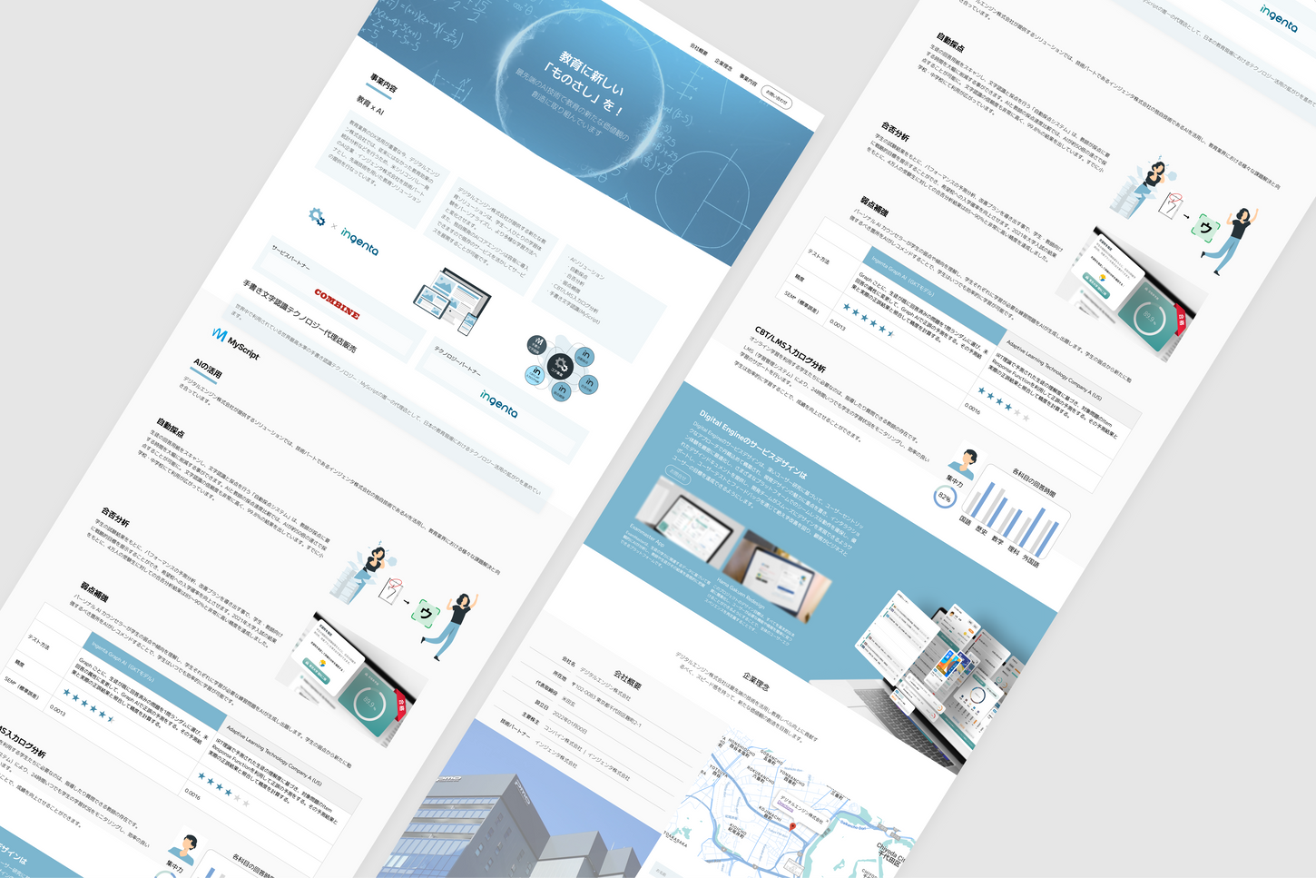
Our design is dedicated to creating a visual experience of clarity and transparency amidst a maze of complex information. We adhere to the principle of 'Simplicity within Details', aiming to ensure that each design element—whether it be a button on a webpage or the overall layout structure—conveys information clearly, while also simplifying the user's operational process.
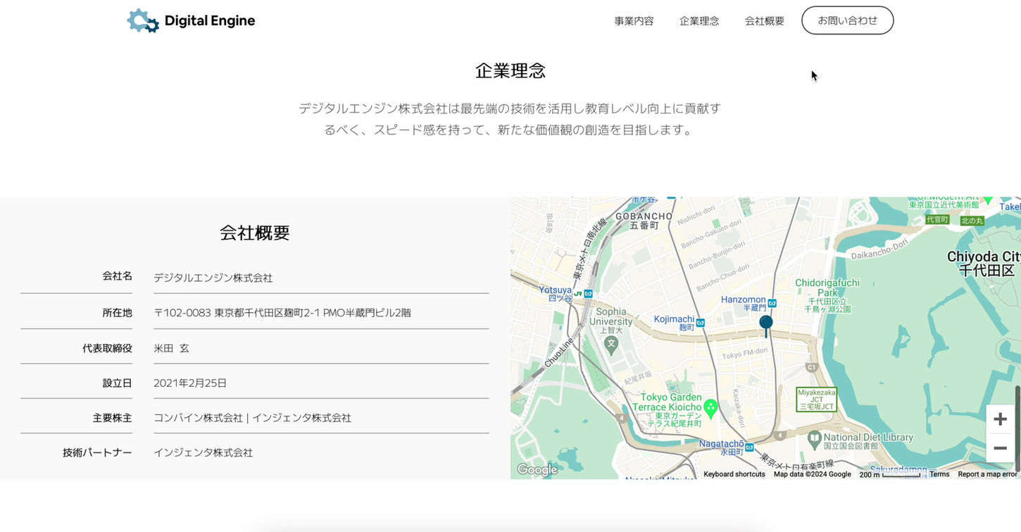
The adoption of our brand colors, lake blue and white, signifies our professionalism in edutech. The overall design employs an intuitive one-page interface approach, allowing users to quickly discern core content and functions.
Our selection of images and charts, meticulously designed to be presented graphically, makes abstract concepts easily comprehensible. Through this method, knowledge is transformed into an intuitive visual sensation, enabling users to understand content with ease, even without a professional background.
Client

